Tuesday, 5 April 2011

Through Different Eyes


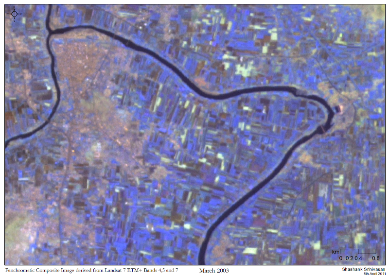
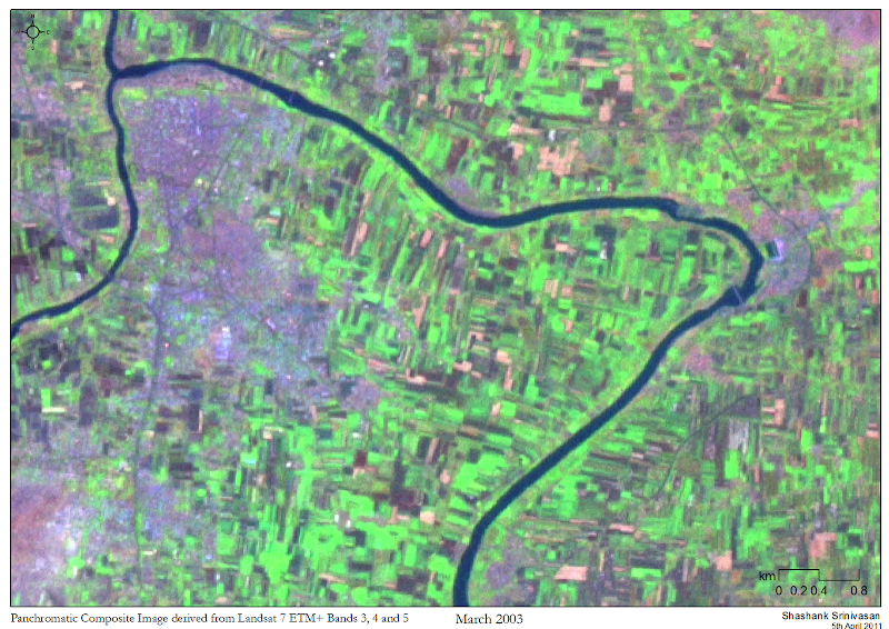
I'm currently working on a project that involves unsupervised classification of Landsat data to highlight barren areas, farms, water bodies and forested areas in Maharashtra, India. I'm using pan-sharpened false-colour composites from the same dataset to help with the ground-truthing; one's been made from bands 3, 4 and 5, while the other's been made from bands 4,5 and 7. They're quite pretty to look at, and it's fun using a slider tool to see how different the surface looks, if only we had different eyes.


In other news, I've finally sorted part of my website out. Big thank you to Rahul (@gonsalves_r), who has been eternally patient with all the tech-support I go on seeking from him. The site's at www.shashanksrinivasan.com and as of next week all visitors to this blog will automatically be diverted there.

Friday, 1 April 2011

The Asia-to-Gaza Caravan


This map was made for the India Lifeline to Gaza, a caravan from India that left for Gaza via a bunch of countries en route. I was asked to make this map for the participants before they left, but a series of communication failures resulted in this becoming a for-charity project; I can't really complain, as I had a great time learning the names of the towns in Iran, especially Isfahan. Reading Lolita in Tehran around the same time just enhanced the desire; while it's a good book on its own, the brief descriptions of the view of the snow-clad Elburz mountains from Tehran were quite appealing.

This was one of the first maps I made, and was created using Google Earth, ArcGIS 10 and InDesign. Making this map made me realise that I liked making maps, I wanted to get better at it and I really needed to learn how to use Illustrator.

Thursday, 31 March 2011

Tributaries of the Ganges


This is my first attempt at creating a Beck map, after Harry Beck, creator of the famous London Underground map. Daniel Huffman (also author of the Cartastrophe blog) has some up on his other blog Something About Maps and they inspired me to try out my own.

It's been made completely in Illustrator, above a map I obtained off Wikipedia Commons. Thus, I'd be grateful if any errors are pointed out.

Monday, 28 March 2011

The Tiger Census 2010


While this is a diagrammatic chart, not a map, it does have a spatial component so I will create a post out of it. The Indian Tiger Census results came out today, and it's heartening to know that there's been an increase in the tiger population. I hope this is the beginning of a rising trend, and look forward to more wild tigers in the near future!

I visualised the data as an exercise in using Illustrator and InDesign; it was quite interesting to actually use ruler measurements to accurately place the ellipses and the median lines. There are definitely faster ways of doing this, but sometimes it's nice to have total control over every single element on an artboard.

Sunday, 27 March 2011

Draft Map of Uppalapadu


Uppalapadu is a gorgeous bird sanctuary near my current town of residence, and I visit it often. It's home to spot-billed pelicans, painted storks and black-headed ibises, and they are literally present in the thousands. I haven't come across any other site, anywhere, with this sort of bird density, and I consider myself really lucky to be living so close to one. This map is a draft version, created using ground knowledge, Google Earth and Adobe Illustrator. A hat-tip to Nafisa for teaching me how to use the pen tool in AI; I'm very grateful.

I'm currently trying to get my website up (www.shashanksrinivasan.com); it's being a bit painful, but soon I'll have a portal to display both my cartographic work as well as my photography, and I hope I'll be able to create cross-connections between the two.

Wednesday, 30 June 2010

Mapping a God


Niyamgiri in Western Orissa is currently the site for a number of controversial projects controlled by Vedanta Resources Plc (UK). The Dongria Khond tribe, who inhabit the region, revere the hill as a god and oppose plans to convert it into an open-pit bauxite mine.

This is a 100m-interval labeled contour map of the hill created using SRTM data. I'm thinking about using Landsat data along with spatial data from other sources to see whether visible changes have been generated by the extant projects.

Since this blog is primarily a cartographic display site, readers who are interested (and furious) like me can Google the words [Church England Vedanta bauxite Orissa Niyamgiri dongria khond human rights violations] in any order, or just access Amnesty International's extremely lucid and well-written report on the topic here, for more information.

Friday, 14 May 2010

Arunachal Pradesh: 3km and above

I've been working on some maps of Arunachal Pradesh; working with ArcGIS is NOT fun. However, ArcGIS together with some file-handling tools (Belvedere), basic Python scripting and ERDAS Imagine makes life a little easier. Not much, but a little:)

This particular set of maps was generated to identify high-elevation regions that may benefit from protected status. In this case, all regions above 3000m in altitude, in Arunachal Pradesh, were identified based on SRTM data. This information was then used to mask a composite Landsat image, which is my intended product.


This is a simple SRTM altitude map of the state.


This is a false-colour Landsat composite of bands 7,5 and 4. The Landsat scenes that comprise this image have been taken in the winter months of 1999, 2000 and 2001.


I've segregated the altitudes into two bands to create a mask; the red indicates areas that are above my target elevation of 3000m, while black indicates areas with an elevation below 3000m.


Finally, I've overlaid the altitude mask on my Landsat imagery and adjusted its transparency and colour so that areas above 3000m now show up very clearly. On the basis of pixel ratios, I estimate that these high-altitude regions make up slightly under 25% of Arunachal Pradesh's total land area.